- For developers
- Industry insights
- People in tech
- Product development
- Tech trends at BCoded
- 6 Mar 2024
- 6 min read
Design system + UI kit = the power in your design journey. Meet PROTEUS, the game-changer
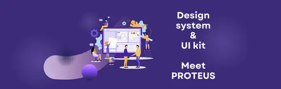
Table of contents
Contributors

There are always going to be questions when it comes to design systems. A lot of software development teams are interested in this subject nowadays. We are ready to answer these often asked topics with the help of Călin, UX/UI designer at BeeCoded.
First question: what’s a design system? It’s all about making digital life easier. It’s like a toolbox full of ready-made parts and rules to keep everything looking and working great in digital projects. An example is Google’s Material Design system, which provides standardized components like buttons, cards, and typography for creating cohesive user interface design across various platforms and devices.
How to use the principles of design systems
- Provide clarity and uniformity: to boost user trust and brand recognition, make sure all digital assets are uniform.
- Simplify flexibility and efficiency: to speed up design and development processes and make it easier to adjust to changing project requirements, use pre-made components like buttons and color schemes, website templates.
- Promote collaboration and alignment: integrate common rules and instruments into the design system to enable smooth cooperation between diverse groups, promoting unity and efficiency.
- Manage growth and adjustment: accept the adaptable structure of design systems to allow enabling the development and scalability of the project, reducing interruptions and ensuring continuity.
- Embrace inclusivity and accessibility: follow the design system’s accessibility rules to ensure that all users have equal access to digital content, thus promoting inclusivity and usability.
Are there stages for design systems?
Yes, there are! Design system’s stages are the essential phases from planning to maintenance. Every step is necessary for building and keeping a functional digital toolkit.
The stages of a design system typically include:
- Planning: defining the goals, scope, and audience of the design system.
- Research: collecting data about brand identity, user needs, and current design assets.
- Design: creating the visual elements, components, user interface design and guidelines that will set the system.
- Development: building the components and documentation, often using code and design tools.
- Implementation: introducing the design system into projects and workflows, ensuring adherence and acceptability.
- Maintenance: regularly updating and refining the design system to accommodate changes and improvements over time.
Design systems vs UI kits
Many people have become confused by several questions: are UI kits and design systems the same thing? What does each do? Do they depend on each other? Well, let’s find out that:
- A design system is like a rulebook that guides how everything in a digital project should look and work. It includes not just UI elements but also principles and guidelines.
- A UI kit, on the other hand, is a ready-made set of UI elements like buttons and icons that can be used to quickly create interfaces. Think of it as a toolbox of design components for website templates.
“Design system is a conglomerate that follows all the rules to generate a UI kit. Let’s think of it as a database containing colors, fonts, dimensions, shadows, animations etc. They provide guidelines for the components of the UI kit. All UI kits are based on a design system.” – Călin
The main challenge with UX/UI kits in 2024: the impact of FIGMA in design system
Firstly, find out that a design system in Figma is a collection of components that can be reused; styles, and rules that support efficient and consistent design processes. It allows you to combine font styles, colors, and other design elements into a single, central location along with user interface (UI) components like buttons, forms, and icons for a dashboard template.
Things look pretty good at the moment, but what is the issue that arises? The primary challenge currently confronting the creative team revolves around the use of UI kits. Curious why? Well, it’s because the workflow of developers and designers frequently involves both the design system and the UI kit. However, the problem arises from the lack of synchronization between these two components.
Figma’s Design Kits and Developer Kits are super important for designers and developers. But, some of these kits are old and tricky to learn. Here’s the thing: there are two separate kits, one for designers and one for developers, which can be a problem because they’re not always in sync.
Luckily, Figma has updates that make changes in design show up in development, too. But, there aren’t many kits that work well for both designers and developers. Even the popular Material Design kit needs more updates and freedom.
So, designers end up using only a few examples, and sometimes they’re not explained well. And when Figma updates, it can mess everything up. Lots of website tools use UI kits, but they don’t give users many choices.
Introducing PROTEUS: best option for both developers and designers
After hearing about the struggles of designers and developers with existing design systems and UI kits, Calin brings a game-changer: PROTEUS.
What’s PROTEUS?
We get that developers and designers are having a hard time because the design system and UI kit don’t match up. This makes everything take longer whenever they need to make changes.
But here comes Proteus, a plugin that operates using AI. It operates like a plug-and-play tool. Once you’ve set its design elements, called parametric design, it will be able to synchronize the design system and UI kit.
Let’s picture a scenario. For instance, imagine you own a website with 100 pages, ranging from “About Us” to the most detailed UX design services. Each page has about 3 buttons, all of which are green. However, you’ve decided to change them to blue from now on.
Because the design system and UI kit aren’t in sync, you’ll have to change each button individually. How many would that be? 300?
Well, once you start using Proteus, this tool that manages to synchronize the design system with the UI kit, the entire process of changing those 300 buttons will just require a few clicks to complete.
What’s special about it?
Proteus integrates design and programming seamlessly. In the MVP, you’ll find only the design, but based on the UI kit, programming is done too. When you make changes in design, they’re automatically reflected in the programming. It’s all synchronized, making things easier.
“The eternal problem between designer and developer: I can’t change that button, because the kit won’t let me”~ Calin
It’s highly customizable compared to other UI kits that are more restrictive. There’s no other engine like it on the market. With other kits, if you want to make changes on your dashboard template or any page you want, you have to figure out how the kit was designed, which can be a headache since most don’t come with documentation. But with Proteus, everything is parameterized, and documentation is auto-generated. So, as a designer or developer, you don’t have to worry about documentation anymore.
Curious about when we’ll be rolling out this feature for fellow designers and developers? Get on the waiting list, and we’ll get back to you very soon.
Established in 2015, Beecoded is not just a software development company; it’s a gateway to the digital future. With over 50 satisfied customers and 80 visionary brands, we’re rewriting the rules of digital engagement on a global scale
Latest blog posts
View all postsWhat Unfolds in a Software Developer’s Day of Innovation?
BEE CODED
22 February 2024Is your SaaS team primed to transform Product Development?
BEE CODED
19 February 2024