- Industry insights
- People in tech
- Tech trends at BEECODED
- 19 Mar 2025
Designing for Conversion: UX Principles That Transform SaaS Trial Users Into Paying Customers
UX design impacts conversion rates?
Table of contents
- Introduction: The Impact of UX on SaaS Conversion
- Key UX Elements That Drive Higher Conversion Rates
- Less is more…clients
- Page Loading Speed Matters
- CTA Buttons Speak Conversion
- Responsiveness Equals High Conversion Rates
- Building TRUST through Design
- How to Design an Intuitive Onboarding Experience for SaaS Users
- Removing UX Friction Points to Maximize Conversions
- USER TESTING METHODOLOGIES
- ANALYSIS TECHNIQUES
- Case Studies: Successful App Design & Optimization
Contributors

Introduction: The Impact of UX on SaaS Conversion
Want to know how UX design impacts conversion rates? Let me ask you this first: Did you know that approximately 80% of the information we process is visual? This tells us just how important the first visual impression is when users open a SaaS application. Your app’s design should invite users to explore and engage, convincing them the product is worth their time and investment.
In this article, we’ll explore the essential UX principles for SaaS conversion that can transform trial users into paying customers. Ready to turn your app design into a powerful conversion tool? Let’s dive in!
Key UX Elements That Drive Higher Conversion Rates
Remember: there are 4 steps of conversion: awareness, interest, desire, and action. Before your users get to the final step (action), in the direction of the desired behavior, your application must first capture their attention, engage their interest, and convince them that the product or service offered is something they truly need.
4 Steps of Conversion
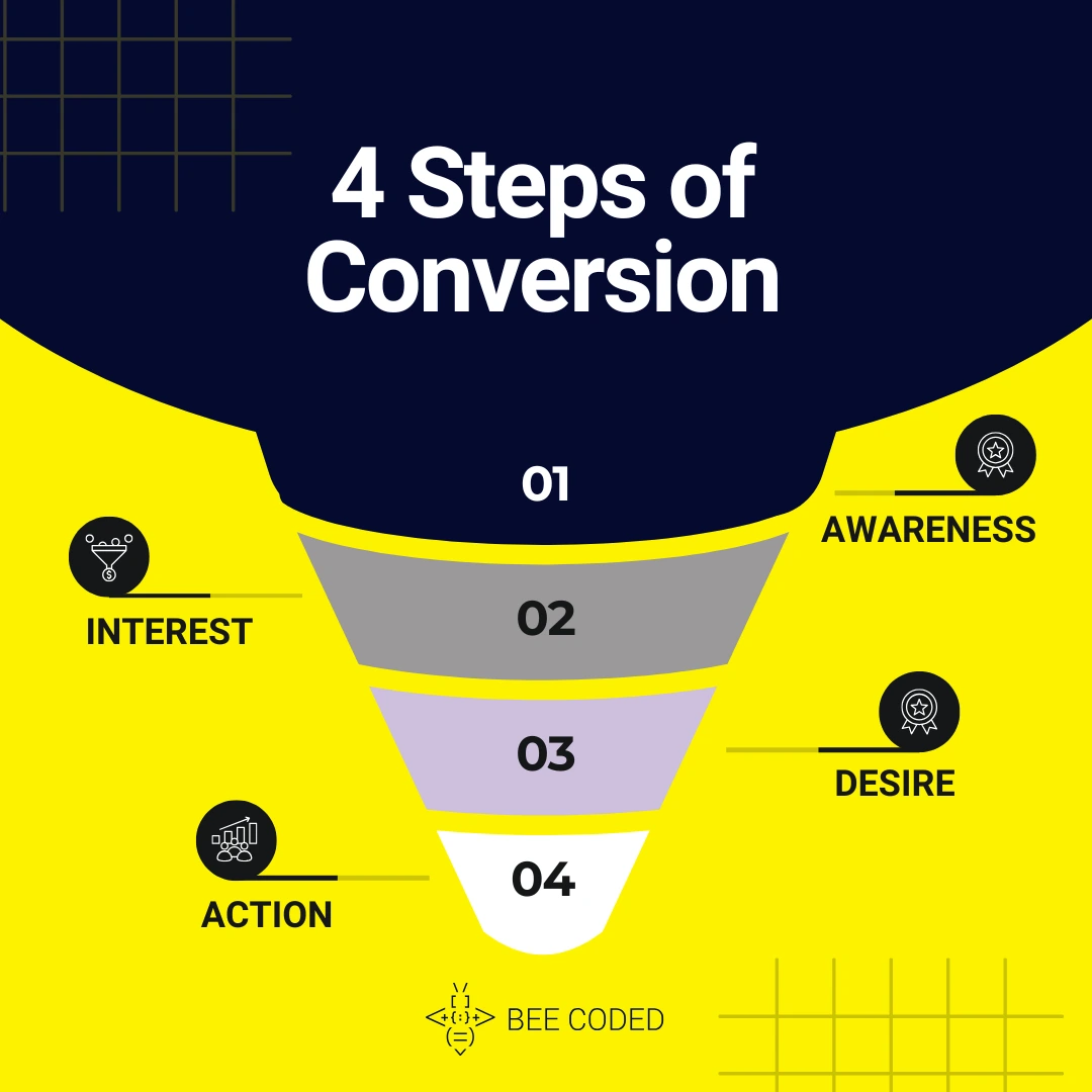 awareness, interest, desire, action
In this section, we have prepared the key UX elements you need to keep in mind to increase your conversion rates.
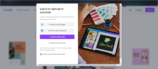
1. Less is more…clients
When we say “less”, we mean less clutter of information that can confuse the user. In this sense, make sure your application has a clear design and intuitive navigation.
A study conducted in 2018 by researcher Emmi Kantalainen shows a positive correlation between design simplification and increased conversion rates.
According to this study, a clean and concise design contributed to a pleasant user experience, which led to more time spent on the page and increased interactions, ultimately resulting in an improved conversion rate.
2. Page Loading Speed Matters
Nowadays, people are used to things happening fast. According to capiproduct.com, studies conducted by Google show that a one-second delay in how fast a page loads can lower conversions by 7%.
3. CTA Buttons Speak Conversion
CTA buttons need to be visible and use action-oriented language. For example, after A/B testing, Bannersnack realized that a larger, higher-contrast action button led to a 25% increase in signups (contentsquare.com).
4. Responsiveness Equals High Conversion Rates
Sites with a responsive UI see a 24% increase in organic search rankings.
Always test that your app is responsive on mobile, tablets, and desktop.
5. Building TRUST through Design
People need clarity. When they see that others have used and enjoyed your app, it builds trust in the platform.
Make sure to include testimonials and reviews in the design, as these can boost credibility and encourage users to explore the platform.
According to seosandwitch.com, adding customer testimonials increases trust and improves conversions by 58%.
How to Design an Intuitive Onboarding Experience for SaaS Users
So, you’ve convinced users that your app is worth signing up for? Now comes the next crucial step: onboarding. This is where you keep them engaged and make sure they stick around.
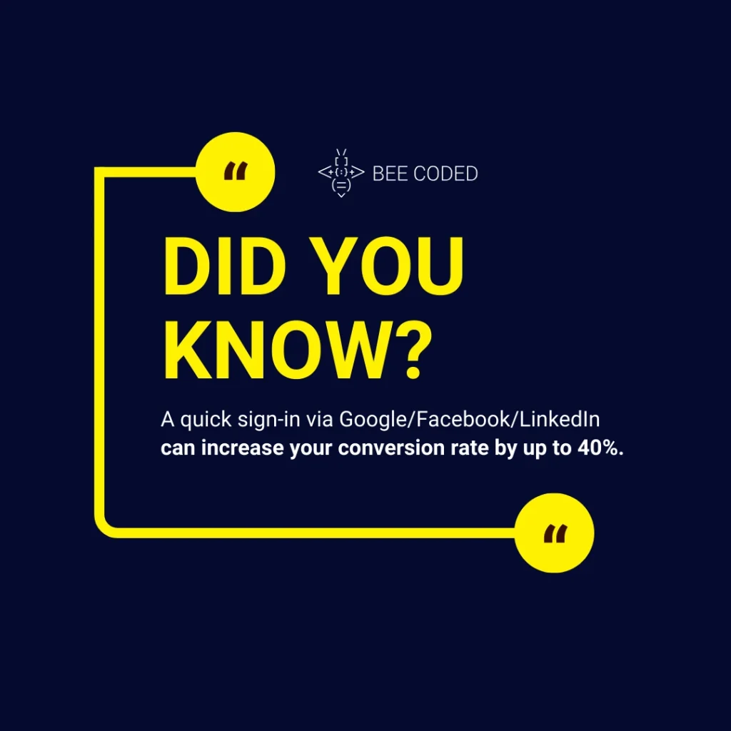
1. Make a Quick Sign-Up
Why: A quick sign-in via Google/Facebook/LinkedIn can increase your conversion rate by up to 40%.
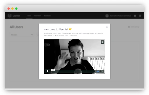
2. Personalize the Welcome Messages
Why: An authentic message written by a real person creates an emotional connection with users.
3. Offer Interactive Product Tours
Why: Interactive tours help users better understand the product and retain more information. Use a guided, hands-on walkthrough with the option to skip or revisit later, allowing users to learn at their own pace.
4. Encourage and Reward Desired Behaviors
Why: Positive reinforcement can boost engagement by rewarding users for completing tasks. Implement small rewards, like points or badges, when users finish certain actions or milestones within the app.
5. Provide Continuous Support and a Resource Database
Why: Users need ongoing access to help, guides, and resources to fully utilize the product. Create an easily accessible support center with tutorials, FAQs, and courses to assist users at any stage.
6. Collect User Feedback
Why: Gathering feedback helps improve the product and shows users that their input matters. Implement short, in-app surveys or email requests for feedback to learn what’s working and what could be improved.
For more details on how to implement these strategies, read our article on SaaS onboarding best practices here.
Removing UX Friction Points to Maximize Conversions
To ensure that your application is constantly improving, in this section, we will discuss user testing methodologies and analysis techniques that will help you identify and eliminate UX friction points.
USER TESTING METHODOLOGIES
- Heatmaps
These show you where users click and scroll on a page. They tell you what grabs attention and what can be confusing or frustrating for users. Use heatmaps at key stages of your user journey, especially when testing layout changes or new features.
- Surveys
Short questionnaires of 3-5 questions give you quick feedback on what works and what doesn’t at key moments. Use them to get insights.
- A/B Testing
Always test two versions of the same page to see which performs better. This will help you improve conversions.
Tools to consider: Optimizely, VWO (Visual Website Optimizer), Google Optimize.
ANALYSIS TECHNIQUES
- Behavior Flow Analysis
This helps you understand where users are getting stuck on your site so you can correct any friction points. You can do this with the help of Google Analytics or Mouseflow, which allow you to track your users’ journey through your site and identify the steps at which they leave the process.
- Funnel Analysis
This one tracks the steps a user takes to identify where they abandon the process, for example, during a purchase. A useful tool here is Mixpanel, which helps you see where users get lost in the process and what needs to be adjusted.
- Session Recordings
To visualize exactly how users behave on your site, you can use Hotjar or Crazy Egg. These tools allow you to record user sessions and notice moments of confusion or mistakes to improve the user experience.
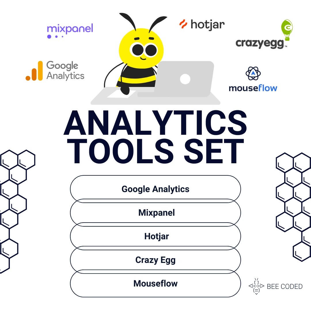 Analytics Tools Set: Google Analytics, Mixpanel, Hotjar, Crazy Egg, Mouseflow
Case Studies: Successful App Design & Optimization
Case Study 1: Money in Motion (MiM)
MiM is a Romanian money management app launched in March 2024 with the help of our team. The goal was to make personal finance more accessible and easier to understand for users of all ages. Our team created a simple and intuitive MVP based on user behavior research. As a result of this collaboration, the app has been a remarkable success, attracting 20,000 installs in the first 10 days of launch.
Learn more about MiM here.
Case Study 2: PRSNT – The Gifting App
Our team took an initial MVP with limited functionality and, by cleaning and optimizing the code, improved the app’s performance, ensuring that it could handle high volumes of users during the Christmas season. In just one month, we launched a fully functional app that met all of the client’s requirements and managed to deliver a flawless user experience.
Find out more about PRSNT here.
Clients recommend us for reliability and faster, accurate tech solutions for their specific business needs.
Tell us about your business challenge